I catch myself defaulting to these four the most:
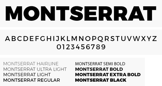
Any new fonts in your rotation lately? What are some you've phased out? I actually loved Montserrat for a good long while (and who didn't?!), but the capital "G" and "J" simply didn't do it for me. Very glad to replace it with Gotham and Prox.
Great design resource
100 Things Every Designer Needs to Know About People (Voices That Matter)
No comments:
Post a Comment