I have to represent a coding concept called the testing pyramid, more info here:
https://martinfowler.com/articles/practical-test-pyramid.html
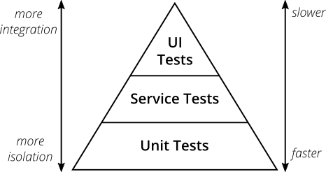
This is the image I'm trying to create:
https://martinfowler.com/articles/practical-test-pyramid/testPyramid.png
What I want to try to figure out is how to represent the arrows on either side graphically. It's a challenge because they represent two different things, but are linked.
First arrow: represents how realistic the tests are, i.e. how close it will be to when the code is complete
Second arrow: how fast the tests are to run.
So the more realistic, the slower the test, the less realistic the faster the test.
I was wondering if there was a way to represent this previous sentence graphically. I was thinking of using colors on the pyramid itself or using symbols, but I can't find a good, clear, understandable solution. Graphics that are often used for realism are the planet or cloud. For speed: rabbit, turtle, clock. None of these are great.
TLDR how do I represent a scale of both speed and realism within a single pyramid graphic?
Great design resource
100 Things Every Designer Needs to Know About People (Voices That Matter)
No comments:
Post a Comment